Very Peri: Soft Purple Stroke with the Pantone Brush
The Pantone Color of the Year 2022 and how we at Schattdecor are interpreting it
For 23 years, Pantone has announced a “Color of the Year” annually - and designers around the world adapt it to their needs and wishes. This year's Color of the Year, Very Peri, is a soft violet especially created by Pantone. It is a color that can be found under the hashtag #dusk in evening mood pictures on Instagram. It is a tone that especially digital natives often encounter in virtual realities: purple fog and clouds wafting where people rest or where particularly magical storylines are unfolding. Violet and purple are shades full of mysticism and meaning, change, departure, and secrets. Very Peri is a self-contained cycle: Analog meets digital, second life meets nature, and in people's minds, esotericism and science create a dialogue.
For a long time, we have been working with gray and sunset tones in modern design - Very Peri breathes new life into the palette. It is a rare color that reminds us of fresh scents and affects us like an idea that brings a fresh breeze to our creative noses.Begüm Özdemir, Head of Design, Marketing and Communication Schattdecor Gebze
What does Very Peri mean?
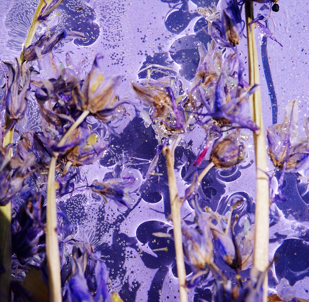
Peri is an abbreviation for the periwinkle plant. The flowers of this spreading evergreen shrub or grown cover are a soft violet. Although violet is its own color in the spectrum, it can of course also be seen as the mixture of two fundamentally different tones that we find in the primary colors: red and blue. While red can be seen as energetic, hot-tempered, and alarming, blue is considered calm, static, and cool. The higher the proportion of red in violet, the more the tone tends towards magenta or crimson, the bluer we find it, the more blue-violet or rather purple is our color result.
The Color of the Year 2022 stands for the change our world is currently undergoing. A change that is coming much faster and more intensely than we thought possible. But: "[...] the complexity of this new reddish-violet shade of blue underscores the vast possibilities that lie ahead," said Laurie Pressman, vice president of the Pantone Color Institute. So, the idea is creativity. The crisis has made us creative and we want to keep it that way. This also applies to our interior design: Purple, violet and magenta nuances should positively affect our creative thought processes. We feel like a new color, a warm and friendly mood that allows us to look to the future with optimism.
As appealing and moving as this delicate violet tone is, it is difficult to use as furniture decor. How do Schattdecor designers around the world deal with this color? How do the trends differ and how can Very Peri be integrated?
Setting Accents
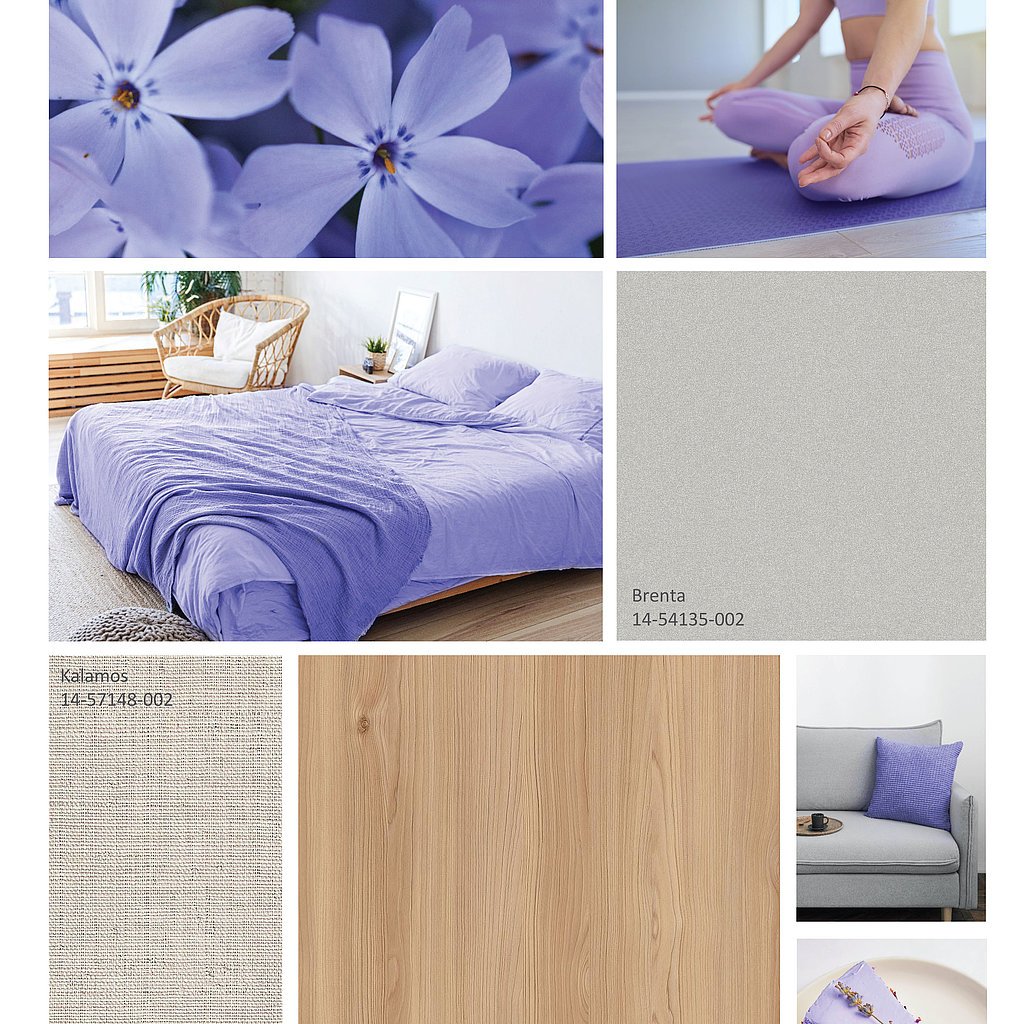
We see Very Peri in different purple nuances for the interior area. “The shade of purple works very well as an accent color, for example in textiles, decorative accessories, on mirrors, in lighting, in tableware, murals and wallpaper. We also see violet sofas, side tables and chairs in our South American markets,” says Elisa Toazza, Manager of Design, Marketing and Communication at Schattdecor Brazil. "We think this shade could open the door for us to mix and match colors and materials that are different from what we're used to, such as warm earth tones, natural softwoods, and colorful marble and metal surfaces."
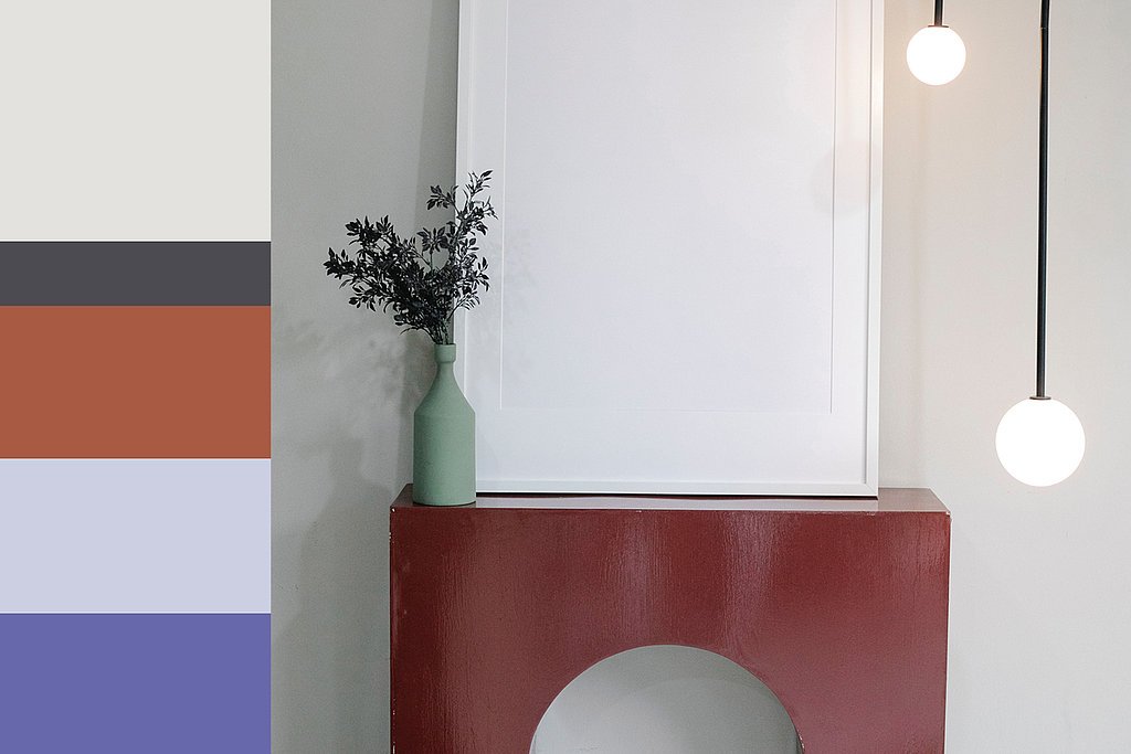
By using complementary contrasts with ocher, orange and red tones, exciting compositions emerge that have the power to create different room atmospheres from soft to lively, depending on the combination of colors in furniture and accessories.
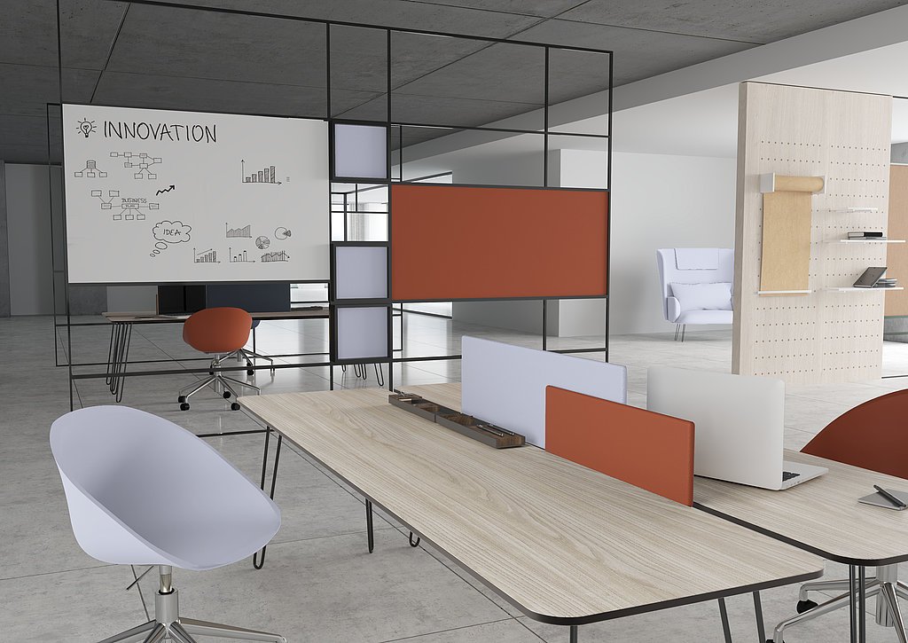
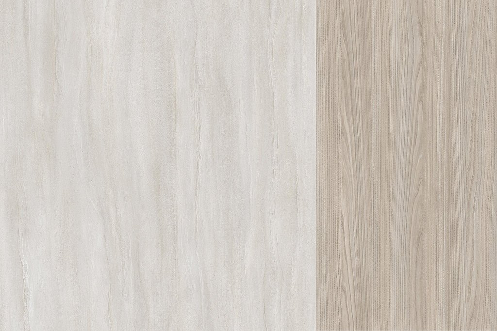
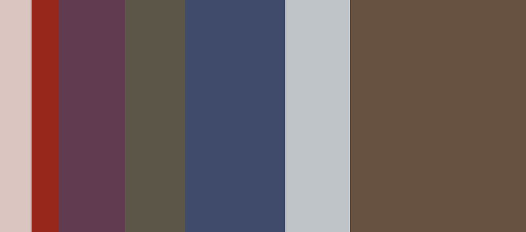
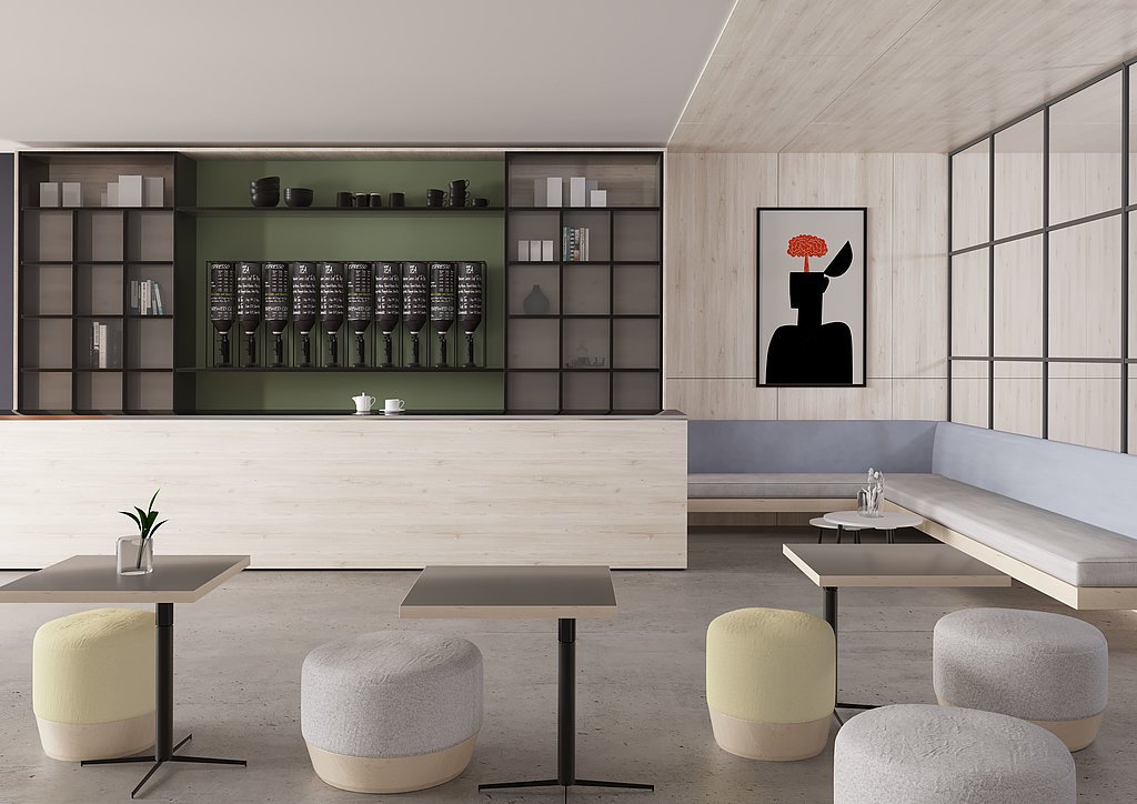
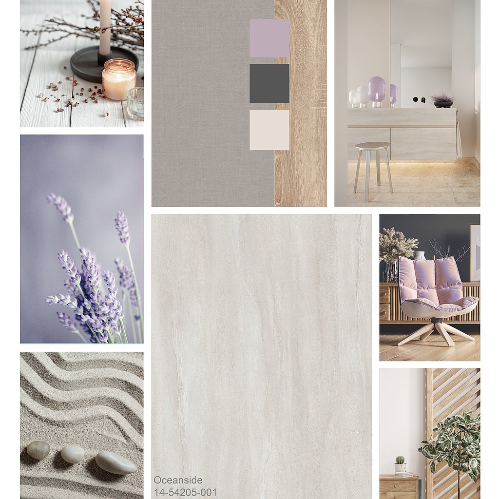
We see a timeless combination under the motto Timeless Office. We have purple as an inspiring component, shades of gray that underline the official character of the rooms with yellow and blue undertones in upholstered furniture, among other things, and muted red that creates an unobtrusive liveliness. Together with airy, light sandstone, which has a gentle roughness due to its fine pores and conveys originality and security, or a fresh, slightly floral and gently playful chestnut, we create a timeless environment in which it is wonderful to work.
Luxury Living
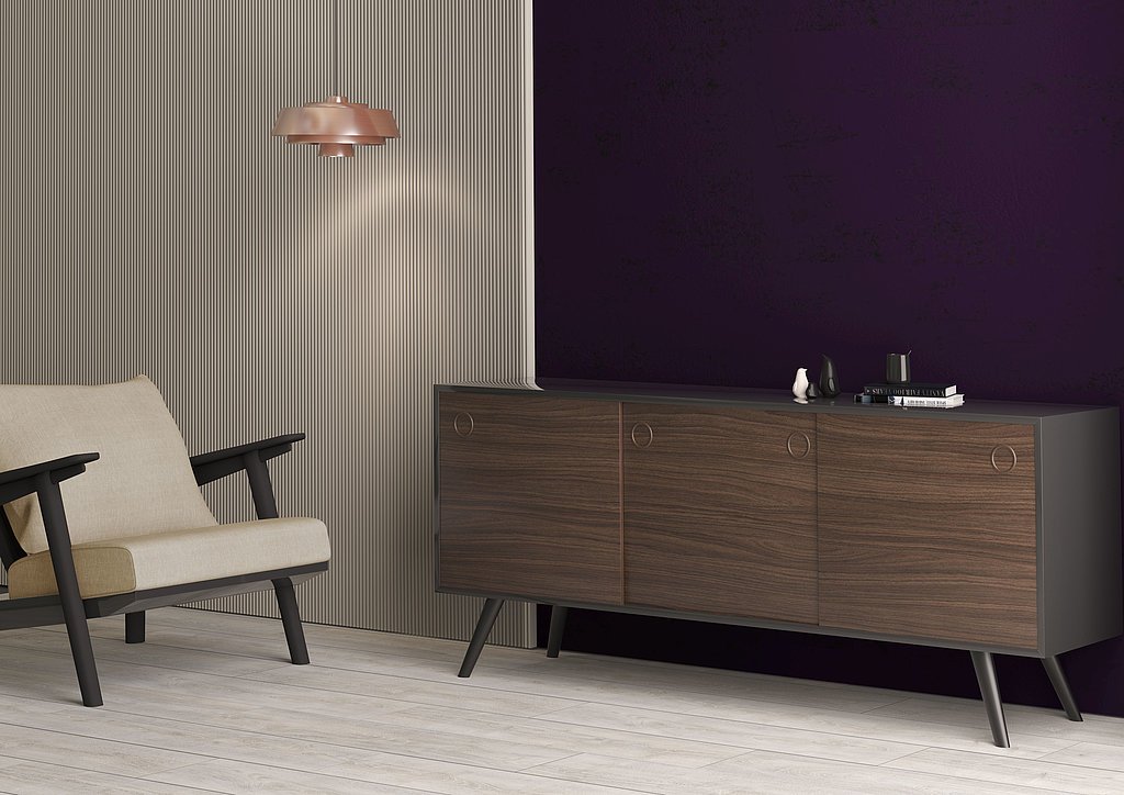
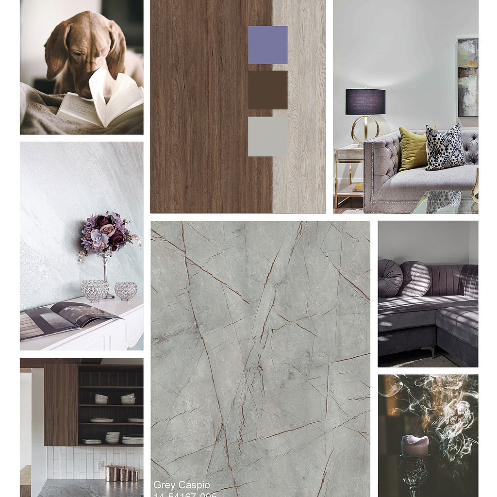
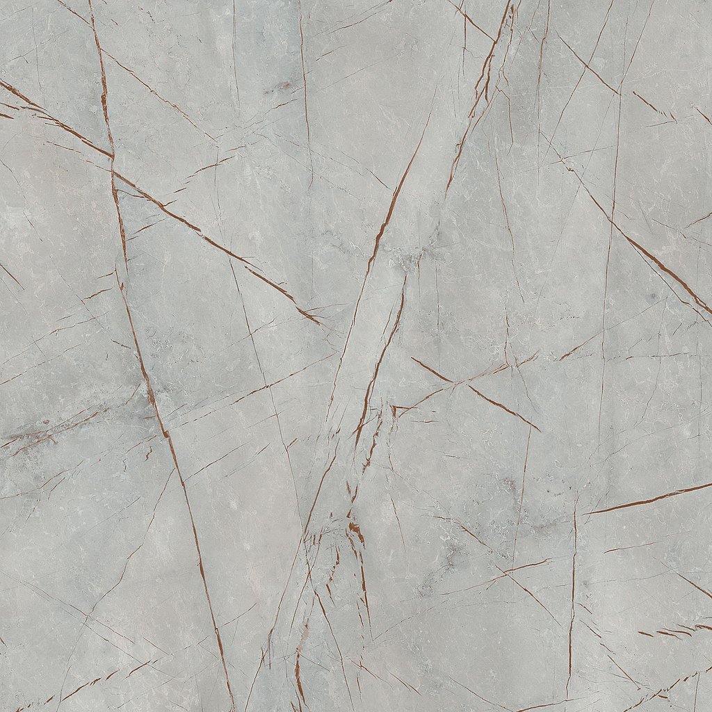
Another aspect of this shade is teased out when we combine it with sparkling metallic details. This creates a luxurious trend that has been around in the Middle East for a long time - since the 90s to be precise. Begüm Özdemir, Head of Design, Marketing and Communication at the Turkish Schattdecor location in Gebze, paints a glamorous picture for us: “Imagine a room with a Very Peri colored velvet sofa. Chrome feet are screwed to it, and next to it is a marble coffee table. Last but not least, a diamond imitation lamp on the ceiling: Et voilà!”
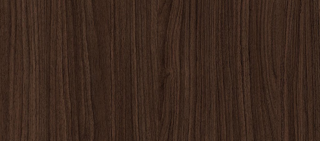
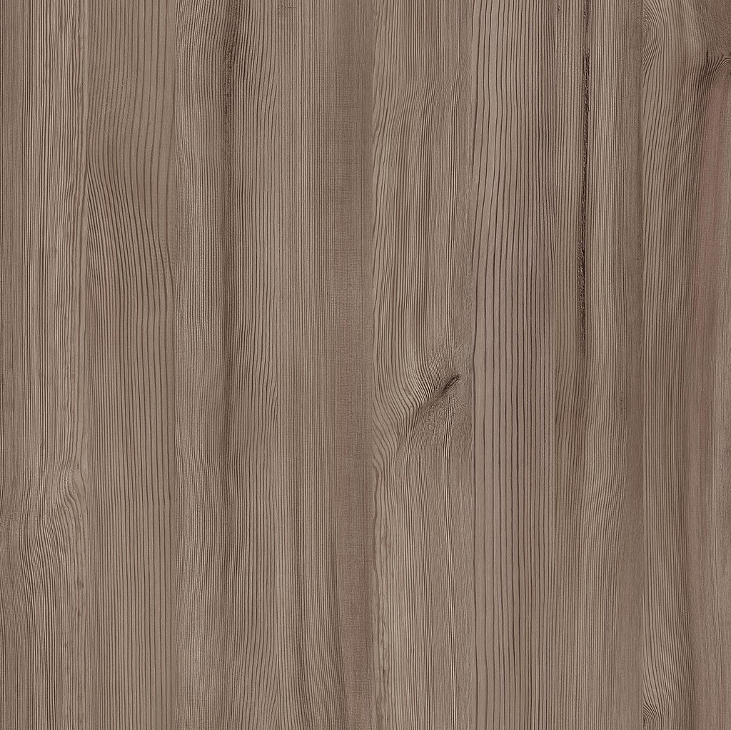
The closed pore structure of dark tropical woods creates an elegant and luxurious impression with its noble shine. Rich berry or crimson tones and deep cobalt blue underline the magnificent impression of space, which is rounded off by metallic applications. Tobacco-colored pine or a subtle walnut tone also works well as wood. This may make the arrangement less opulent, but it remains very noble.
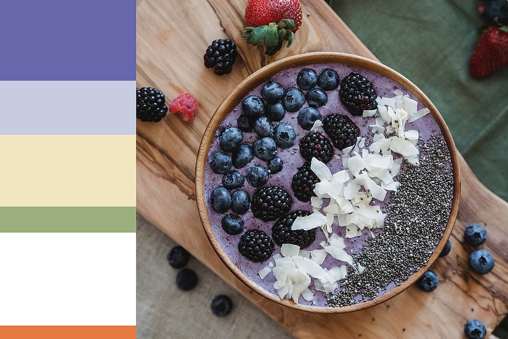
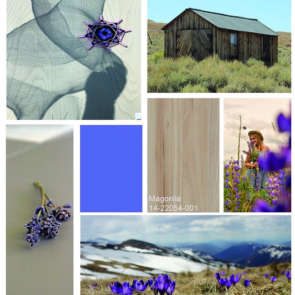
Violet nuances in combination with lush green and vanilla yellow and cream tones make the interior look youthful and spring-like. We then find fresh accents thanks to the use of natural coniferous wood. The ensemble gets a futuristic look with bright candy colors and metallic surfaces.
Mood: Violet
Very Peri is a conceptual color, it represents the current zeitgeist, the connection between the real (physical) and the digital world. It emphasizes materials such as white marble, concrete, warm metals, and woods in natural colors.Elisa Toazza, Managerin Design, Marketing and Communication Schattdecor Brazil
Very Peri is already in here
So Very Peri is kind of a color chameleon?
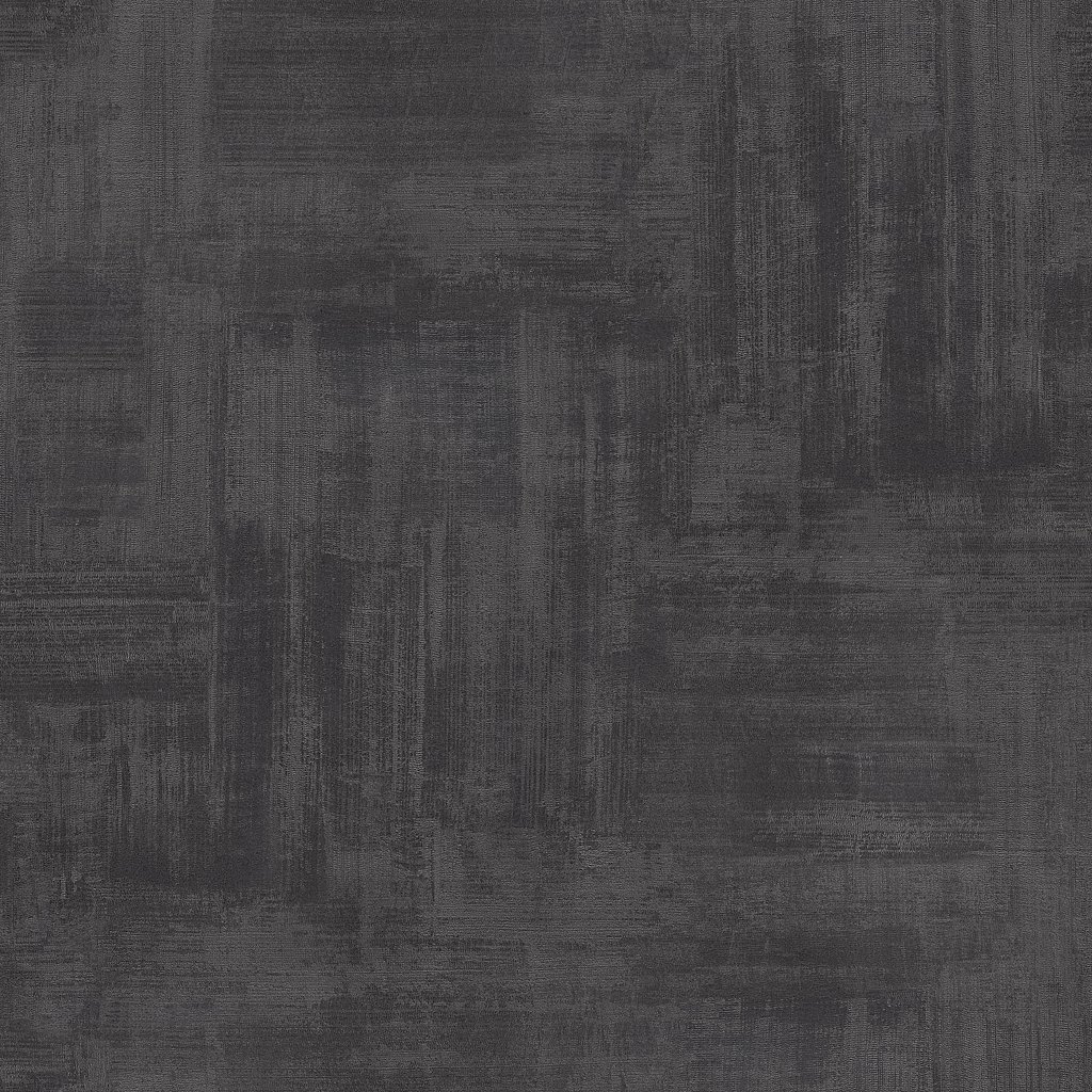
For Schattdecor designer Elaine Herrmann, Very Peri is changeable like the modern world. “Combined with modern, muted color shades, this violet tone can find a home in a natural, classic furnishing style. However, together with berry tones and metallic accents, Very Peri is in good hands in the luxury sector.” It can also tease out shimmering purple or gray nuances in existing decors and can thus put a completely new complexion on them.
Very Peri is certainly not an everyday color. And an initial murmur across all industries given the design challenge may be understandable at first glance. But: With a sensitive and clever combination, this tone can become much more than first expected - and it may even elicit a contented hum from a skeptical murmur.
