Blue: The color without a name
blue: a bright color, in the spectrum a relatively short-wave color between green and violet; Basic color of many color models, especially one of the three basic colors of the digital RGB color space.
We know that the eye and brain are interconnected so much that it's impossible to "see" something that the brain has no name for. In ancient times, this happened to the color blue. Nearly nobody in the ancient world had a word for it, because blue was very rare in the natural world – even the sky wasn't always "blue".
In ancient times, nobody could put "blue" into words, apart from the Egyptians, who were already capable of reproducing the color by using dyes.
We now consider blue as one of the most popular colors throughout the world – and with good reason
The pantone color of 2020 is "Classic Blue", and conjures images of relaxing with a glass of wine on the terrace of your vacation home, while the sun slowly sinks into the sea. It's a blue as deep as the Indian Ocean between Mauritius and the Maldives, a color that you sense like a firm embrace, telling you that "everything's fine" and "I'm here for you".
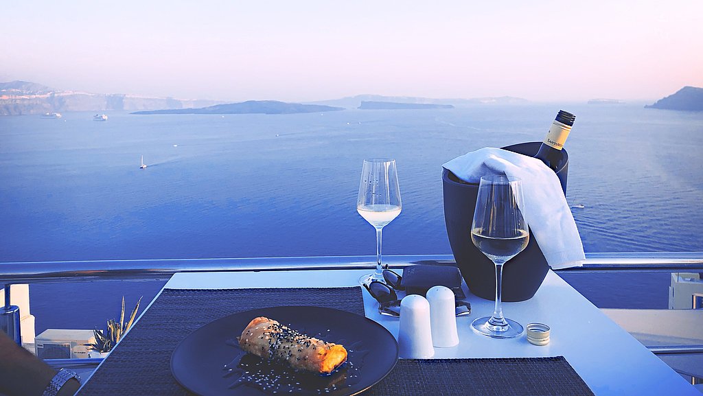
Blue represents stability
Loyalty, harmony and trust. For some, blue also represents trustworthiness, imagination, friendship, reliability and sympathy. It embodies coolness, as a complementary color to orange, the hottest color of the spectrum.
It's a good enough reason to ask our design colleagues, what can blue be combined with. What goes well with it, and what brings out its best properties? What would our designers do if they were allowed to do exactly what they wanted?
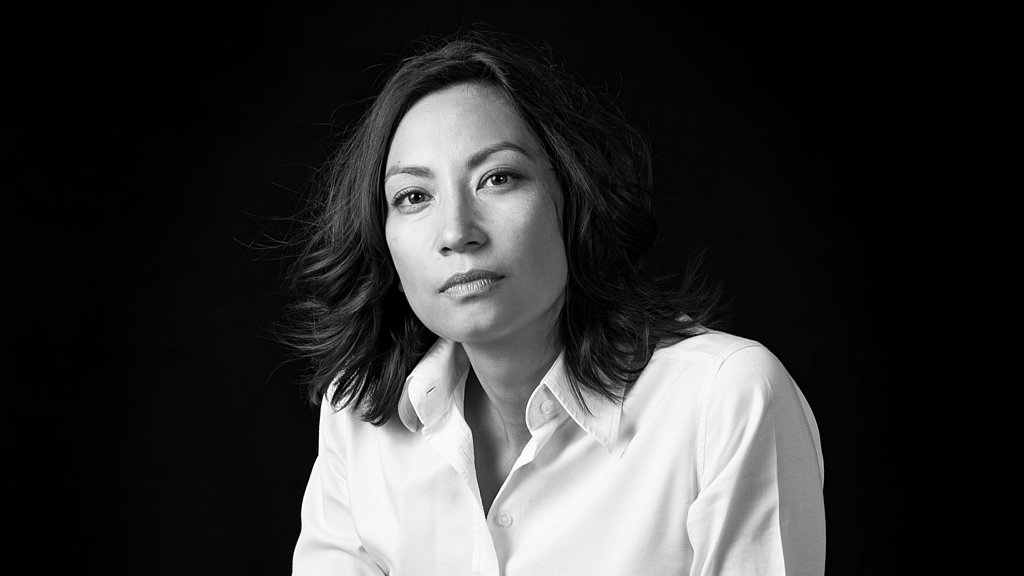
"The contrast between intensity and reduction creates a nice balance."Sabrina Wieland | Head of the design department Schattdecor AG Thansau
“The use of color in living spaces sets great accents. In particular colored walls underline or change the style and effect of the interior. This means that new statements can be easily set. Effect and statement vary with the color. Many are initially hesitant about the use of strong tones, especially when it comes to long-term decisions such as the use of wall paint. These can be well chosen and matched to the furnishings for a great atmosphere and a room climate that makes you feel good. Combined with the right materials, this creates a harmonious living character - a home that makes you feel good with a personal touch.” says Sabrina Wieland, head of the design department at Schattdecor.
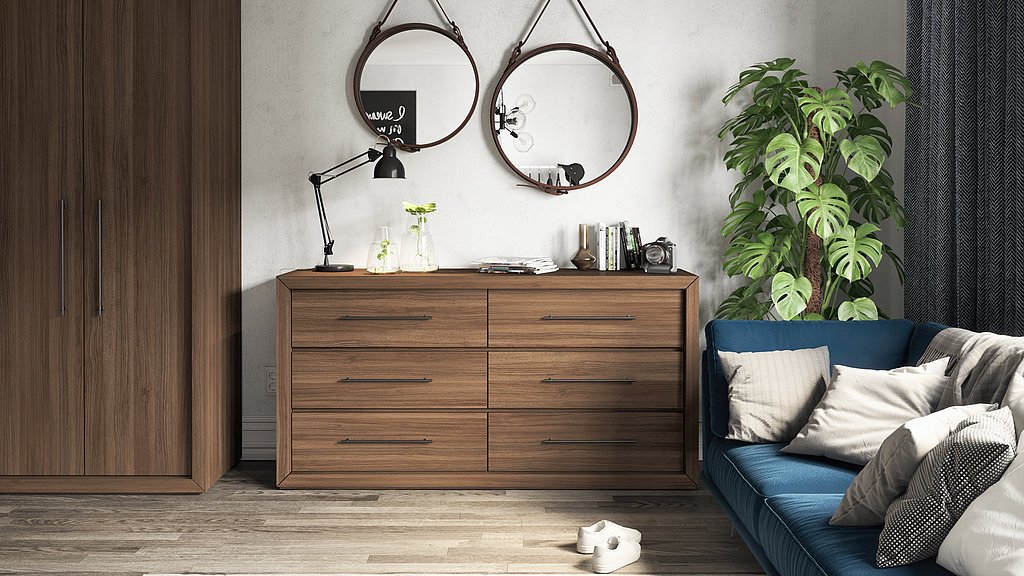
“Rich colors can often be combined very well with plain surfaces, for example with a metal look. The symbiosis here is exciting: the contrast of intensity and simplicity creates a nice balance. This is also interesting in rooms that have to be able to do both, like the kitchen: it should appear homely, but also functional and classy. In the living and sleeping areas, textile and wood decors can be easily combined with strong wall colors. Blue goes hand in hand with exciting textile patterns, but also with classics such as oak decors or tropical wood in dark brown tones. Depending on the variant, different ambiences are created that embody one thing: a feeling of home. "
Blue represents silence, relaxation and calm
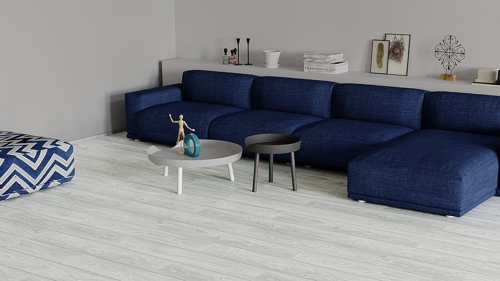
Inspiration out of inspiration
Apart from living spaces, blue can also be used in workspaces and public spaces. Also, blue rooms or blue accents create conditions for a positive working environment, as blue is supposed to help with concentration. Blue provides a feeling of security that fosters inspiration and allows us to work creatively.
Whether in your home office or a physically and geographically separate office or co-working space. Cafés and other publicly accessible spaces also benefit psychologically from clever interior design – people always react to various stimuli – usually unconsciously. As an example, consumer behavior can be controlled indirectly to a certain extent and demand can be created that hadn't existed before.
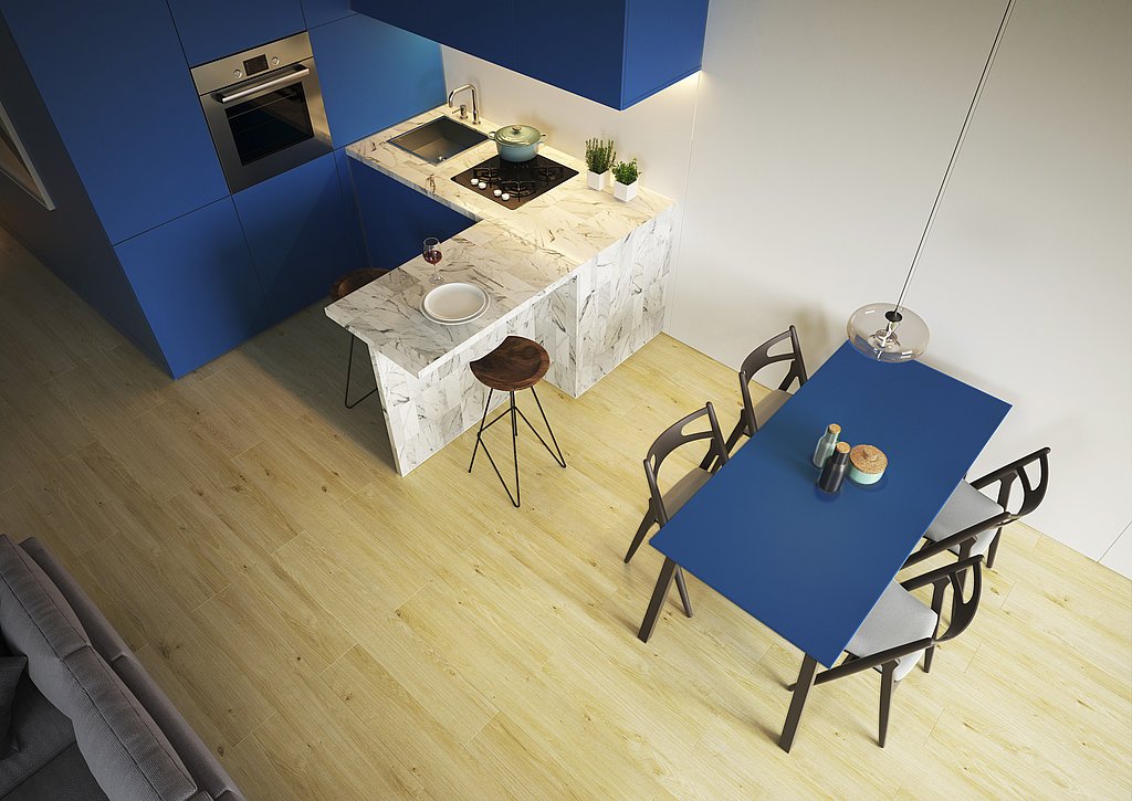
Safe and secure while traveling
Stability, security, comfort – these feelings also inspire new travel habits. Nowadays, more and more people take their homes wherever they go. Stopping at Norway's fjords, mountaineering in South Tyrol, or sleeping in Portugal with the sound of the sea in the background. A motor home or caravan lets you experience all of this. The cherry on top is that you get to experience all of this from the cozy security of your own home. It simply means that we can take our hideaway with us, wherever.
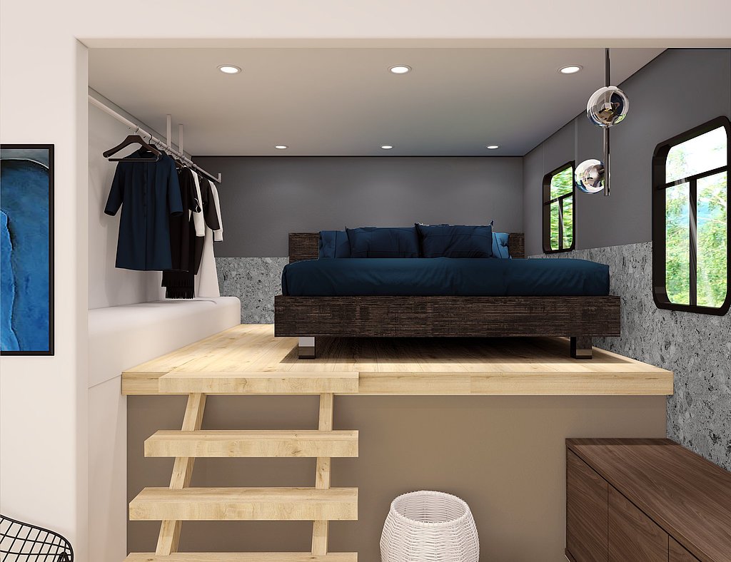
Andrea Herrmann, designer specializing in digital printing, for example, has thoughtfully designed an entire caravan interior based on a deep blue tone – because color also works in small rooms if the conditions are right.
"Blue is creativity and joy."Elaine Andrea Herrmann | Designer Schattdecor AG
"For me, blue represents security, home, and also creativity and joy. That's why I immediately thought of a blue interior when I created our caravan selection. Combining blue with Canyon Vigo Oak, Prato, Maremma and Camargue Oak turns small caravan interiors into friendly and cozy loft-like spaces that look almost as large as the real thing."